Shortcodes
This is an example of a modal. You can copy the code by clicking the "Show Code" button above. Copy the code between the "Start" and "End Modal Dialog Comment" and paste it where desired within the target HTML. If you use more than one dialog modal on a page, make sure you create a unique ID for each. You can set the width of the modal as a percentage of the width of the screen. For example, if you set the max-width to 80%, then you should also set the left margin to 10%. The left margin is calculated by taking 100% minus the max-width percentage and dividing the remainder by 2.
Modal Code
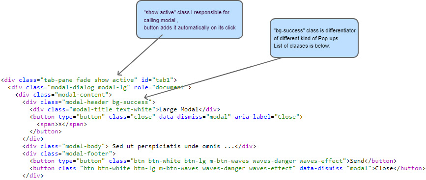
<div class="modal fade m-modal show" id="largeModal" tabindex="-1" role="dialog" style="display: block; padding-right: 17px;" aria-modal="true">
<div class="modal-dialog modal-lg" role="document">
  <div class="modal-content">
    <div class="modal-header bg-success">
      <div class="modal-title text-white">Large Modal</div>
      <button type="button" class="close" data-dismiss="modal" aria-label="Close">
        <span> × </span>
      </button>
    </div>
    <div class="modal-body">
      Sed ut perspiciatis unde omnis iste natus error sit voluptatem accusantium doloremque laudantium, totam rem aperiam, eaque ipsa quae ab illo inventore veritatis et quasi architecto beatae vitae dicta sunt explicabo. Nemo enim ipsam voluptatem quia voluptas sit aspernatur aut odit aut fugit, sed quia consequuntur magni dolores eos qui ratione voluptatem sequi nesciunt. Neque porro quisquam est, qui dolorem ipsum quia dolor sit amet, consectetur, adipisci velit, sed quia non numquam eius modi tempora incidunt ut labore et dolore magnam aliquam quaerat voluptatem. Ut enim ad minima veniam, quis nostrum exercitationem ullam corporis suscipit laboriosam, nisi ut aliquid ex ea commodi consequatur? Quis autem vel eum iure reprehenderit qui in ea voluptate velit esse quam nihil molestiae consequatur,
    </div>
    <div class="modal-footer">
      <button type="button" class="btn btn-white btn-lg m-btn-waves waves-danger waves-effect">Send</button>
      <button class="btn btn-white btn-lg m-btn-waves waves-danger waves-effect" data-dismiss="modal">Close</button>
    </div>
  </div>
</div>
</div>
Button Code
<button class="btn btn-white btn-lg m-btn-waves-float mb-2 mr-1 waves-effect waves-float" data-toggle="modal" data-target="#classicModal">
  <i class="far fa-file" aria-hidden="true"></i> Classic
</button>
Instructions
Modal Classes
- modal-sm: Small-sized modal
- modal-lg: Large-sized modal
- m-bottom-modal: Positions modal at the bottom of the viewport
- m-top-right-modal: Positions modal at the top right corner of the viewport
- m-top-left-modal: Positions modal at the top left corner of the viewport
- m-bottom-right-modal: Positions modal at the bottom right corner of the viewport
- m-bottom-left-modal: Positions modal at the bottom left corner of the viewport
- m-right-modal: Positions modal at the right side of the viewport
- modal-xl: Extra-large-sized modal
- modal-dialog-centered: Centers the modal vertically and horizontally within the viewport
- modal-dialog-scrollable: Enables scrolling within the modal if its content exceeds the available height
- fade: Adds a fade-in and fade-out animation effect to the modal
- show: Displays the modal by default (useful when using JavaScript to toggle modal visibility)
- modal-fullscreen: Expands the modal to full-screen size
- modal-fullscreen-sm-down: Expands the modal to full-screen size for small and extra-small screens
- modal-fullscreen-md-down: Expands the modal to full-screen size for medium, small, and extra-small screens
- modal-fullscreen-lg-down: Expands the modal to full-screen size for large, medium, small, and extra-small screens
- modal-fullscreen-xl-down: Expands the modal to full-screen size for extra-large, large, medium, small, and extra-small screens